Stanford
LOGOS, BRANDING, DESIGN, SCHWAG
If you’ve been to Stanford’s campus, you’ve probably seen some of my work. Over the course of three years, I designed logos for four of the university’s student organizations.
In 2015, Beam, Stanford Career Education, enlisted me for a rebrand. I worked with the organization’s thought leaders to create a logo that reflected their brand strategy and aligned with the emotive words empowerment, fun, connectivity, and transformation. The result was a reflective, bouncing light that exemplified the nonlinear nature of a career and building transformative connections.
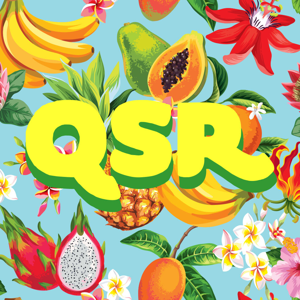
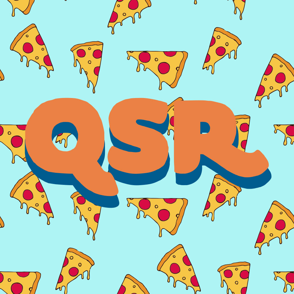
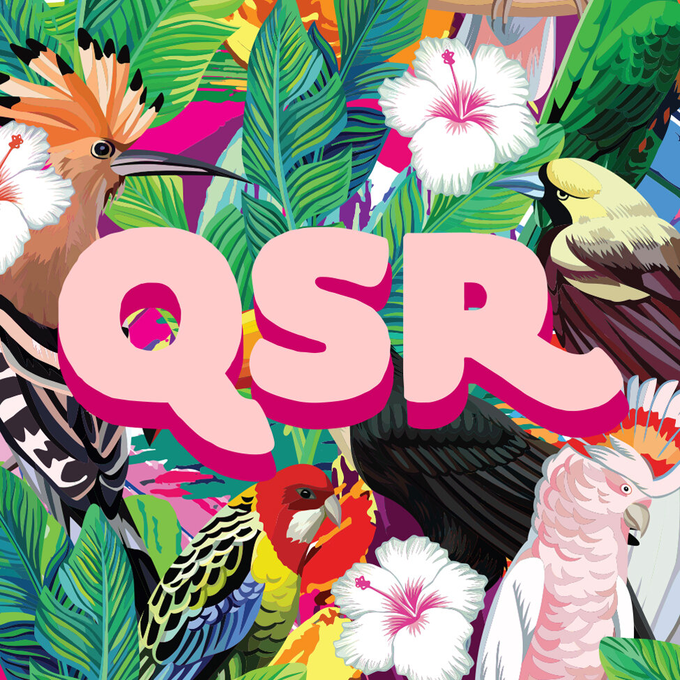
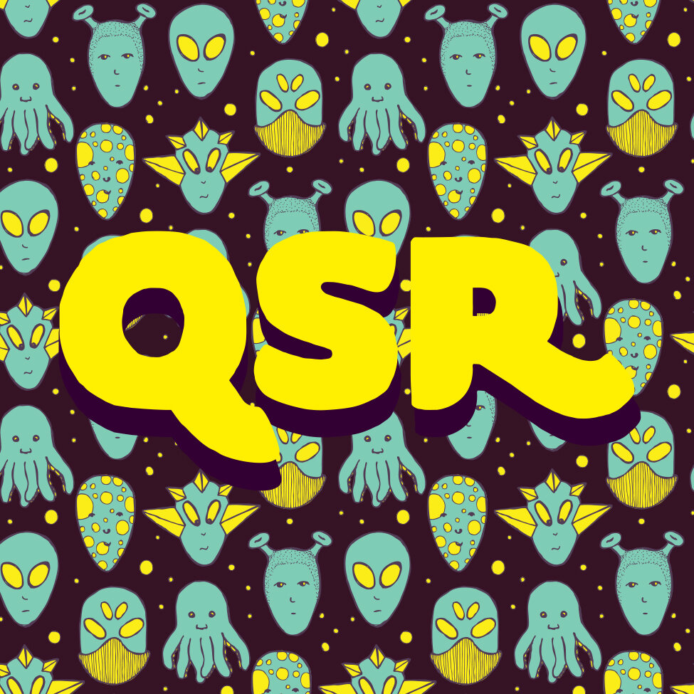
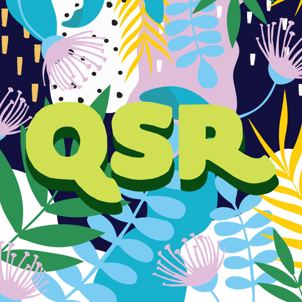
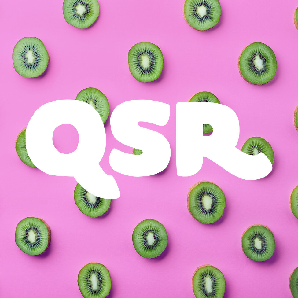
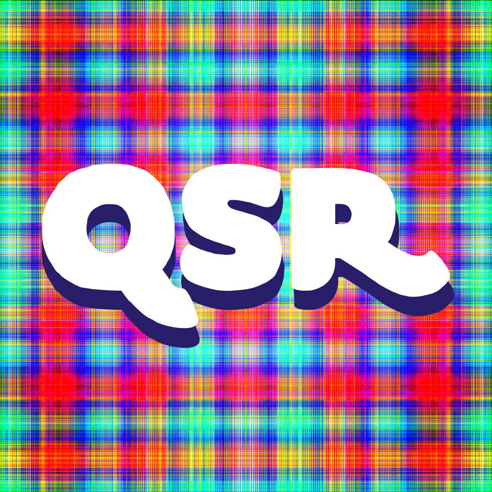
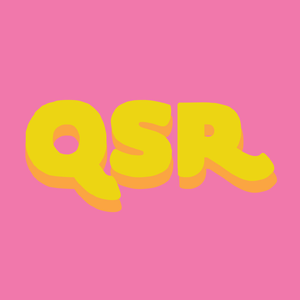
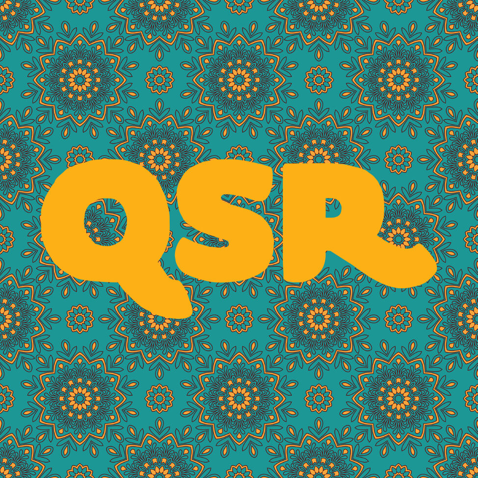
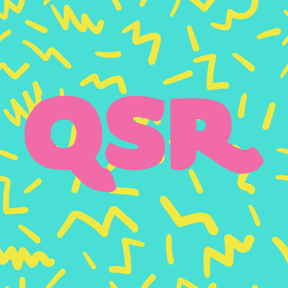
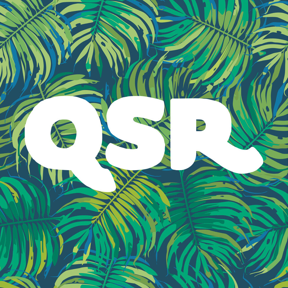
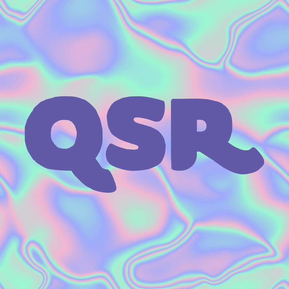
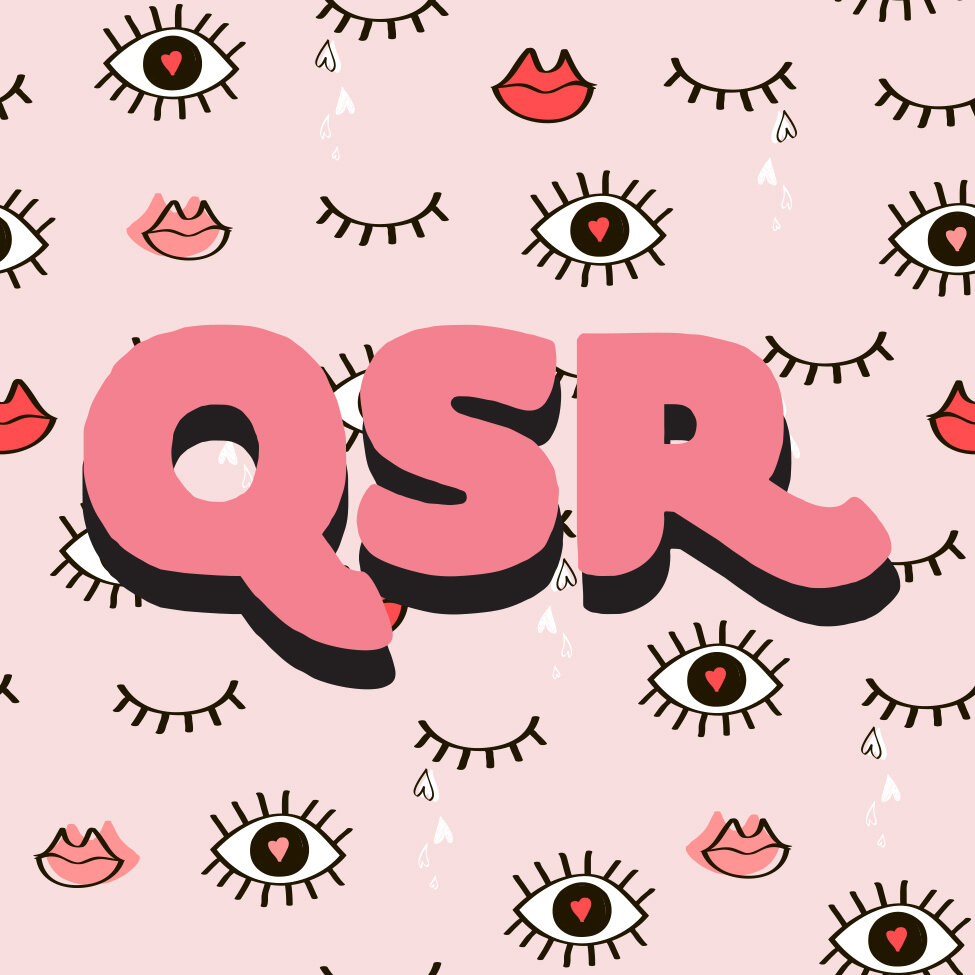
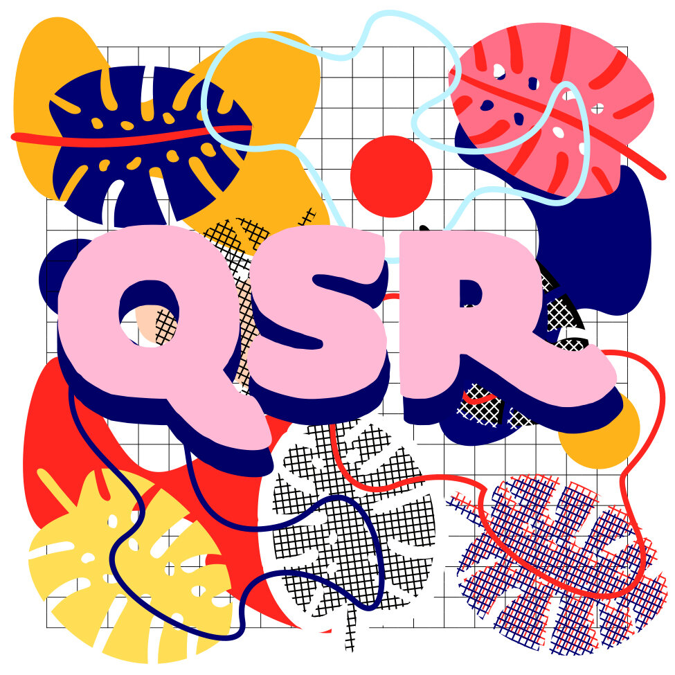
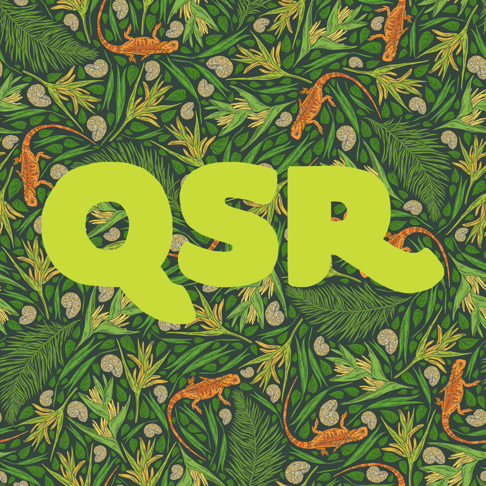
In 2018, the LGBT Community Resources Center went in on a full brand redesign. They needed a new look that fit their new, more inclusive, name: Queer Student Resources. Inclusion was key to the organization’s brand makeover. The new visual language would need to speak to the entire spectrum of queerness: trans, non-binary, gay, bi, lesbian, and all identities in between. They wanted their logo to move beyond the clean geometric shapes of modernism and have a more tactile feel. I created a substantial, hand-drawn logo that could act as a vessel for different graphic elements, representing diversity through color, pattern, repetition, etc. The logo’s imperfect edges reflect the fluidity of language and politics surrounding queer identity. I went on to apply the new system to a series of t-shirts, stickers, and fans, including a 2018 iteration based on the Brazilian Tropicália artistic movement.
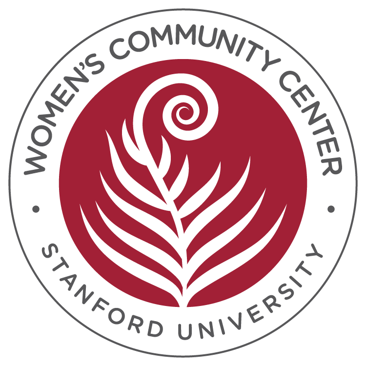
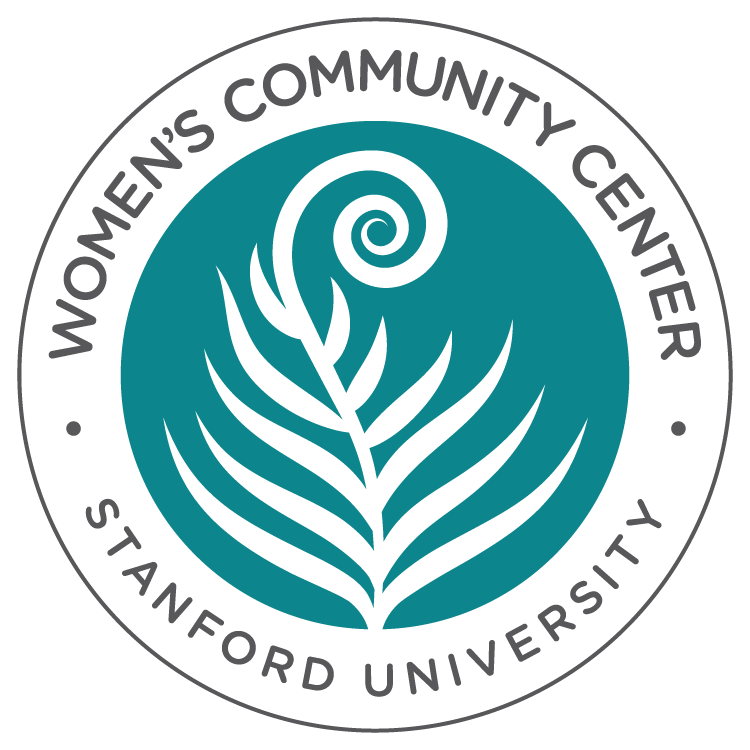
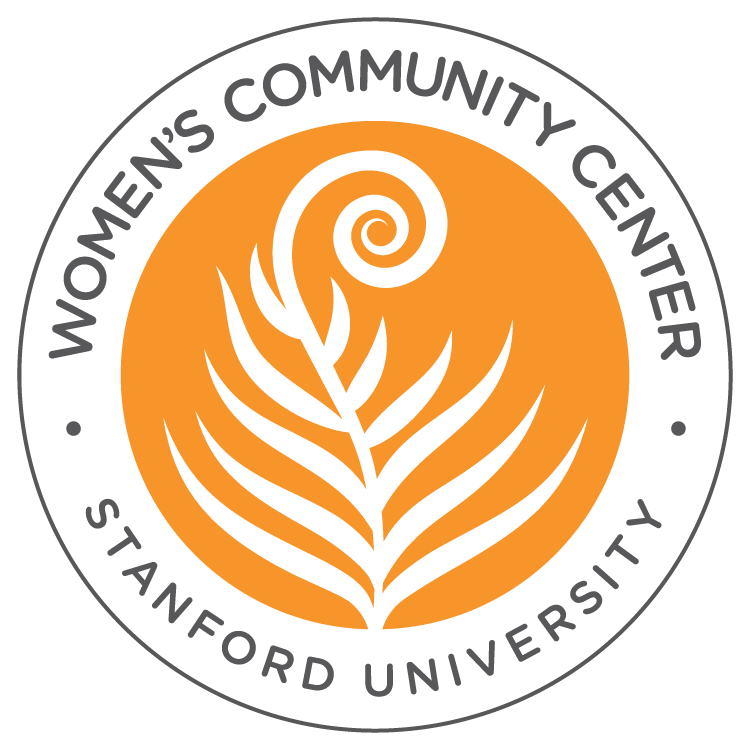
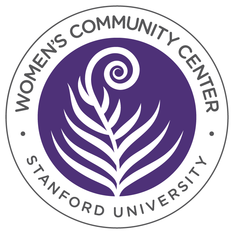
After I completed the QSR brand redesign, I started working on a logo for the Women’s Community Center. They wanted a logo that reflected radical love, inclusivity, intersectionality, courage, community, empowerment, and confidence. Adrienne maree brown’s Emergent Strategies popped up repeatedly during the research phase. I found inspiration from brown’s examples of how nature inspires her methods of organizing for change. She talked about the idea of fractals and how what happens in the cell is also happening to the whole. In other words, what is happening at a small scale happens at a larger one. I used the fern, a stunning example of fractals in nature, as a symbol of unity and organization in the final logo.
Last, I created the logo for the newly formed Stanford Centers for Equity, Community, and Leadership, an umbrella organization for the school’s seven identity-based student groups. The logo was inspired by the art of weaving and the spirit of innovation behind Gee’s Bend quilts. ECL was born of the need to give the seven student groups one voice while allowing each to serve the needs of their respective student communities. Like ECL, the quilt represents unity and diversity in equal parts.
As The Grass Agency, Christopher and I worked with QSR twice more to create graphics to represent their framework and theme each time it changed. We also helped WCC expand their brand with swag with custom Baggu bags, Towels, and keychains. We also helped ECL document the first three years of their work with a 65 page print retrospective which once again allowed us to work collaboratively with 7 student organizations. (You can see a PDF copy at that link. Images of the printed book and WCC swag are coming soon.)
Credits:
Logos, Design, & Tropicália Illustration: Reena Karia
Standford Branding & Trademarks: Stanford University
QSR Sticker Illustrations: Various Sources