KZK JEWELRY
UX, UI, MARKETING, SIGNAGE, SOCIAL MEDIA
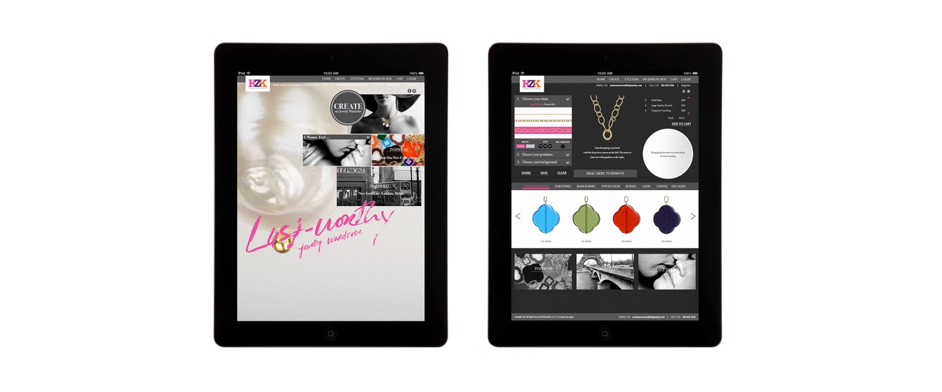
TKZK Jewelry was a Pandora like start up with a line of mix and match pendants and chains who wanted to be first to market to have a drag-and-drop design feature for customers to create unique combinations on their website. They came to me with a logo, a color scheme, and initial user flows. Building a website for this purpose was a difficult task because of the feasibility of the code, but also because of the CMS requirements. (This was before Shopify was big.) I worked closely with the developers of Directus and a lead developer at Zynga who was taking a side gig to make sure the designs were achievable with the backend framework. There were around 500 pendants that needed to be labeled and photoshopped in order for the drag-and-drop jewelry design feature to work. We also had to build all the cart features, account creation screens, email follow ups, and e-commerce features like promo codes from scratch. There were a lot of details that we had to figure out that a person launching an e-commerce site in 2024 doesn’t have to. PayPal, the merchant account darling of the time, was handling the payments.
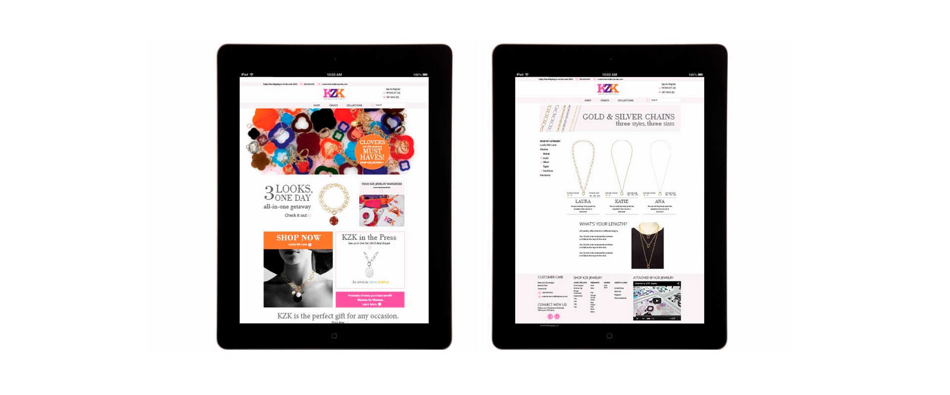
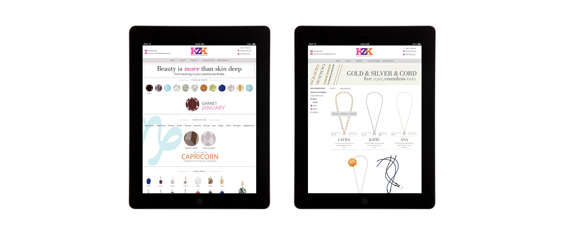
We launched with the first version of the site in 2013. At the time, people were still experimenting with e-commerce websites. One of the founders came from the world of publications in New York City, so the first version of the homepage was more editorial like a magazine. To shop, customers could use the drag and drop feature to select pendants, create a look, and buy the whole set. However, after launching the first version of the website, we learned that the audience found it too time consuming and too cumbersome to only use the drag and drop feature to purchase jewelry. It was not a streamlined process especially for people new to online shopping. It was hard to search for a color, browse, and just buy one pendant. We were engaged in user testing in real time gathering qualitative data from customers and could look at the quantitative data from Google Analytics. The people had spoken and in three weeks, we launched a second version of the website. We redesigned the homepage to be more streamlined and straightforward in the messaging and ways to access the jewelry. We added a conventional shop where you could view each pendant in a grid and add it to your cart without going through the drag-and-drop design process. These feature changes greatly increased conversion rates and we had great feedback about usability from customers.
KZK had great press in magazines and were even featured on the TODAY show that we built a mini site for. But eventually they found their audience, and it wasn’t online. They had more sales at home hosted trunk shows and they put their focus there. Unfortunately, the pandemic closed the door on that chapter and eventually the business.
Credits:
Research, Identity, UX, UI: Reena Karia, Domenic Pagalilauan
Concept: Reena Karia, Joli Glantz, Christine Clayton, Domenic Pagalilauan
WEBSITE ITERATIONS – V.1, V.2, V.3